Last week U.S. Vice President Mike Pence sought to reassure the country that there was no need to fear a “second wave” of coronavirus infections. Two days later Anthony S. Fauci, director of the National Institute of Allergy and Infectious Diseases, delivered a less optimistic view: “unfortunately for us, we still are in the first wave.”
These two statements belong to a burgeoning and now ubiquitous discourse on the shape of the COVID-19 pandemic, a conversation vital to how we think about and respond to the epidemic. Is the most recent rise in new cases—the sharp increase in case counts and hospitalizations reported this week in several states—a second wave, or rather a second peak of a first wave? Will the world see a devastating second wave in the fall?
Epidemic waves help to visualize and reason about COVID-19 data, but they also do much more—serving, in part, as an instrument for public health management and prediction.
Such imagery of waves has pervaded talk about the propagation of the infection from the beginning. On January 29, just under a month after the first instances of COVID-19 were reported in Wuhan, Chinese health officials published a clinical report about their first 425 cases, describing them as “the first wave of the epidemic.” On March 4 the French epidemiologist Antoine Flahault asked, “Has China just experienced a herald wave, to use terminology borrowed from those who study tsunamis, and is the big wave still to come?” The Asia Times warned shortly thereafter that “a second deadly wave of COVID-19 could crash over China like a tsunami.” A tsunami, however, struck elsewhere, with the epidemic surging in Iran, Italy, France, and then the United States. By the end of April, with the United States having passed one million cases, the wave forecasts had become bleaker. Prominent epidemiologists predicted three possible future “wave scenarios”—described by one Boston reporter as “seascapes,” characterized either by oscillating outbreaks, the arrival of a “monster wave,” or a persistent and rolling crisis.
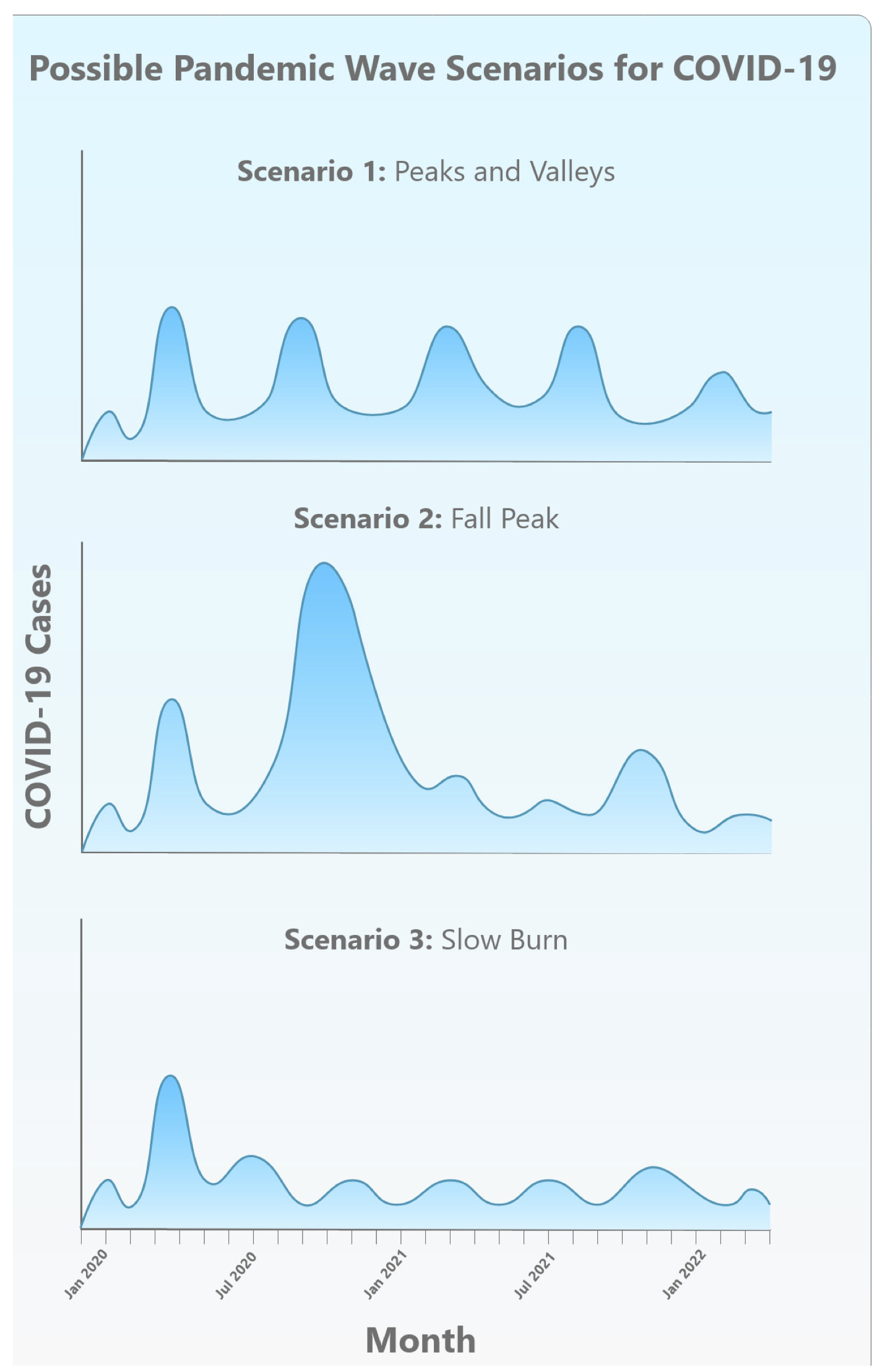
From Kristine Moore et al., “The Future of the COVID-19 Pandemic” (April 30, 2020). Used with permission from the Center for Infectious Disease Research and Policy, University of Minnesota.
While this language may be new to much of the public, the figure of the wave has long been employed to describe, analyze, and predict the behavior of epidemics. Understanding this history can help us better appreciate the conceptual inheritances of a scientific discipline suddenly at the center of public discussion. It can also help us judge the utility as well as limitations of those representations of epidemiological waves now in play in thinking about the science and policy of COVID-19. As the statistician Edward Tufte writes in his classic work The Visual Display of Quantitative Information (1983), “At their best, graphics are instruments for reasoning about quantitative information.” The wave, operating as a hybrid of the diagrammatic, mathematical, and pictorial, certainly does help to visualize and think about COVID-19 data, but it also does much more. The wave image has become an instrument for public health management and prediction—even prophecy—offering a synoptic, schematic view of the dynamics it describes.
This essay sketches this backstory of epidemic waves, which falls roughly into three eras: waves emerge first as a device of data visualization, then evolve into an object of mathematical modeling and causal investigation and finally morph into a tool of persuasion, intervention, and governance. Accounts of the wave-like rise and fall of rates of illness and death in populations first appeared in the mid-nineteenth century, with England a key player in developments that saw government officials collect data permitting the graphical tabulation of disease trends over time. During this period the wave image was primarily metaphorical, a heuristic way of talking about patterns in data. Using curving numerical plots, epidemiologists offered analogies between the spread of infection and the travel of waves, sometimes transposing the temporal tracing of epidemic data onto maps of geographical space. Exactly what mix of forces—natural or social—generated these “epidemic waves” remained a source of speculation.
Today’s accounting of COVID-19 infections inherits an overlapping history of metaphorical, mathematical, and moral messaging.
As struggles against epidemics continued into the twentieth century, scientists developed new ways of thinking about epidemic waves, including mathematical models meant not just to describe but also to predict disease propagation. With such models the wave gradually became more than a metaphor and a mere graphical accompaniment to statistical representation; it was now a naturalistic and technical object, one whose causal basis might be discovered and understood. Just as Isaac Newton had moved from gathering data on planetary motion, to describing possible governing laws, to inferring the existence of a fundamental force—gravity—so a new generation of mathematical epidemiologists sought to characterize the origins of epidemic waves, treating them not just as patterns of data but as the result of some more fundamental underlying mechanism. Along the way, the medium of propagation—the population—came increasingly to be considered a material thing, not just a mathematically abstract object.
We live now in a third era, in which the imagery of epidemic waves is widely mobilized in both public health and public culture to describe, prognosticate, and urge—to ask people to band together to “flatten the curve.” As the New York Times early on summarized the idea, “Slowing and spreading out the tidal wave of cases will save lives. Flattening the curve keeps society going.” The seeming simplicity of the wave image is therefore infused with moral messaging, animating a mix of resolve, fear, and reassurance. The future wave becomes an emblem of power and anticipated terror, ignored at our peril. It is telling that Hokusai’s 1829 Great Wave woodcut, a classic image of a looming and dangerous wave, is visually quoted in so many popular press pieces about coronavirus and its waves.
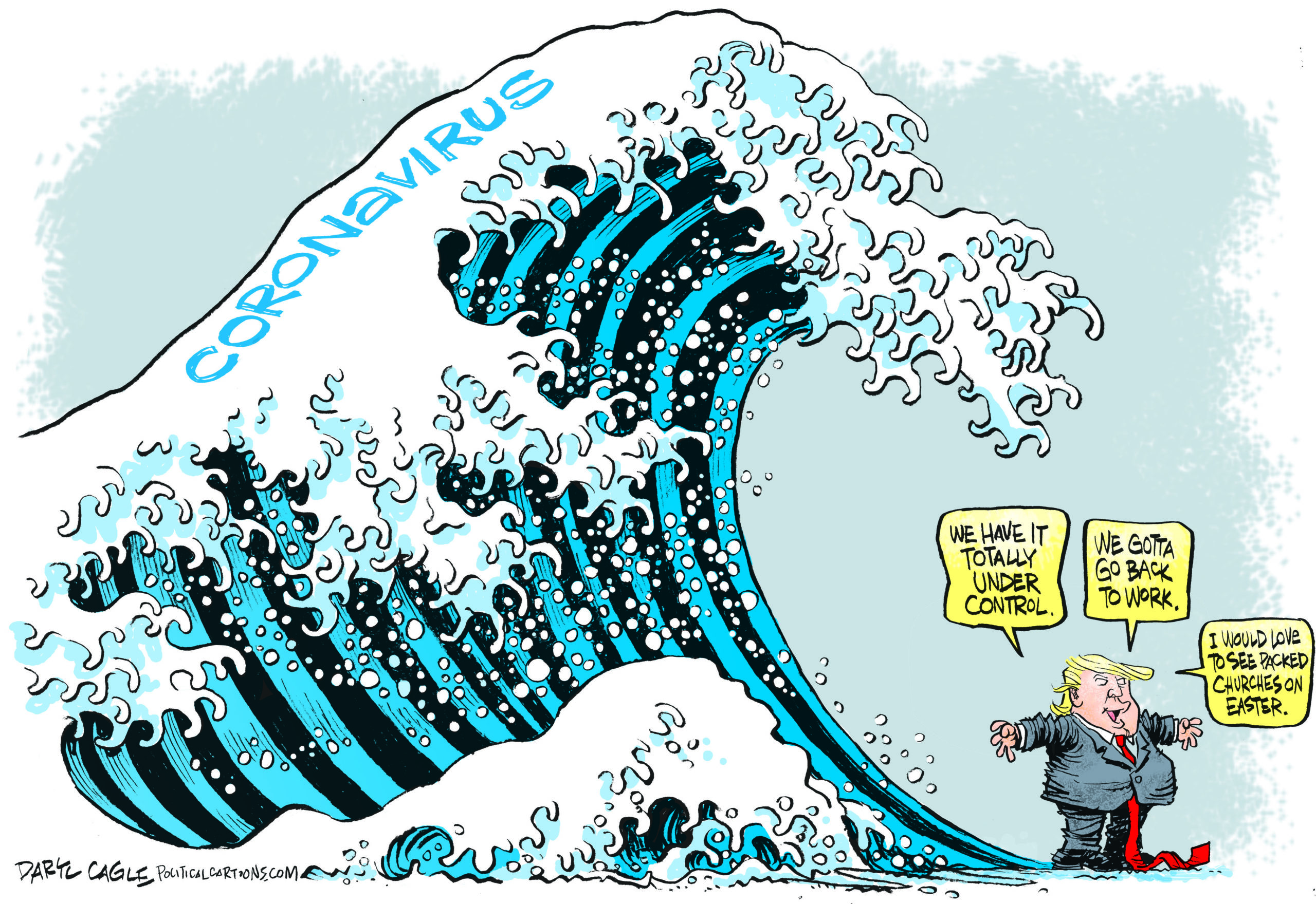
“Coronavirus Tsunami” by Daryl Cagle, CagleCartoons.com.
Today’s accounting of COVID-19 infections thus inherits an overlapping history of metaphorical, mathematical, and moral messaging. Beyond their implications for strictly scientific reasoning, representations of COVID-waves shape the way we think about the social meaning of epidemics and the actions we take against them. The language that scientists use—their metaphors and rhetoric—influence how members of society at large judge and implement scientific knowledge (think only of metaphors of DNA as “programs,” of brains being “hardwired,” or, in a visual register, of graphical representations of stock market trends as waves).
Representations of COVID-waves shape the way we think about the social meaning of epidemics and the actions we take against them.
At one level, hydraulic metaphors of epidemics as waves, tsunamis, or “perfect storms” cast them as natural phenomena. That framing can obscure the ways that what we often call natural disasters are not physically autonomous—something we simply must accept—but rather deeply shaped by human action, both before such disasters hit and as they are managed. This is especially true of epidemics, which are strongly contoured by measures societies take—or fail to take—both to prevent impending epidemics and to mitigate their effects when they strike. We also know that risk is not evenly distributed across the social world but instead follows structures of inequality, by class, race, gender, nation, and many other axes of difference—facts not well captured by the most pervasive diagrams of COVID-19, with models, predictions, and waveforms that focus solely on infection and death counts over time.
As we continue to grapple with the twenty-first century’s first significant pandemic, thinking carefully about the representation of epidemiological information can enrich our capacity to reflect on underlying matters of causality and policy not captured within the frame of the graphic, as well as matters of social structure and political priorities—of whose lives are assumed to matter, where, and when.
• • •
From Metaphor to Object: The Emergence of Wave Imagery
Epidemics, as both events and objects of study, are ancient, but it was only in the nineteenth century that epidemiology emerged as a named discipline of knowledge and practice. In the intervening centuries, epidemics had of course been described, counted, and mapped, but the emergence of the scholarly field coincided with growing concern about the epidemics of smallpox, measles, tuberculosis, and cholera that repeatedly swept through increasingly urbanized societies. These crises, along with new governmental commitments to the collection of “vital statistics” such as birth rates and death rates, inspired new modes of analysis that sought to identify the laws that governed the spread of epidemics.
In the nineteenth century, concern about diseases such as smallpox, along with the collection of “vital statistics,” inspired new modes of analysis that sought to explain how epidemics spread.
One of the first steps taken in this direction was made by British physician William Farr, who, examining records of the 141,607 deaths that had occurred in 1838 in England and Wales, found variations between city and countryside, among various professions, and over changing seasons and postulated that such dynamics might “follow laws of their own.” Though he never arrived at a wave metaphor, his ruminations on “the propagation of epidemics” saw him reaching for naturalistic analogies, his works full of images of rising mists and conflagrations. His language also suggested rising and falling epidemic indices tracing bell-curve shapes over time. Even as Farr compared epidemics to natural processes, he knew well that human action, especially vaccination, “disturbed, and sometimes arrested” epidemics.
The earliest suggestion that we have found that disease manifested in waves appears in the work of Daniel Blair, surgeon-general of British Guiana, who tracked yellow fever in the Americas. In the 1850s the usual pattern of alternating dry and rainy seasons broke down, leading to a year with frequent rain. Yellow fever broke out in Brazil and spread northwest along the coast, reaching the Caribbean, New Orleans, and eventually Bermuda. But, Blair noted, there were exceptions to the “hypothesis of a great epidemic wave, rising in the east, and flowing on westerly.” As he described in 1856, New Amsterdam, in British Guiana, had suffered only a few cases: it “may have been caught, so to speak, in the eddy of that great epidemic wave, which so peculiarly affects the sea margins.”
Many of Britain’s imperial administrators shared this concern about the spread of disease throughout the far-flung empire. Robert Lawson, deputy inspector-general of hospitals for the British military, analyzed disease data collected by medical officers in the 1820s and 1830s, and also saw patterns—both temporal and geographic—in the spread of fevers. As he explained in 1861, there was a “regularity and progression of the oscillations of febrile disease at so many points on the earth’s surface, far removed from each other,” he wrote. “There seem to be a series of waves, generated in southern latitudes, which flow to the north or north-westward in succession.” He named this the “Pandemic Wave,” though remained unsure of its cause. Lawson shared Farr’s faith that the wave-like regularity of epidemics reflected some underlying force; he suspected magnetism.
The maritime setting and inspiration for the wave metaphor is telling: in contexts of European colonialism, the sea, as a vital conduit for imperial enterprise, offered a rich source of imagery, poetic as well as political. The medical geographies of nascent epidemiology became overlaid with what we could call medical oceanographies, reinforcing a sense of epidemics as natural processes washing over peoples and polities. That sense may have been fed by the kind of God’s-eye administrative view favored by colonial powers. These writers were part of the vast British imperial machine, and they often portrayed epidemics and other calamities inflicted on colonized populations as organic events, not events for which colonial powers had any responsibility.
In 1868, Arthur Ransome, a Manchester physician, returned to Farr’s work and expanded upon it. He argued that physicians needed good data and statistical analyses to unlock epidemic patterns, and he made analogies to weather: “Like the cyclones of the atmospheres, these storms of disease can only be tracked, and the laws of their course discovered, by the combined efforts of many observers.” With such data, Ransome argued, statistics could help “to ascertain the conditions under which epidemics arise, and the laws which govern their progress.” Citing Farr, he asked after “The Wave of Epidemic Disease,” writing that “the course of each disease, when it becomes epidemic, has a remarkably regular, almost symmetrical arrangement, in its ascent and decline.” He returned to the subject in 1883 with this striking comment:
The course of an epidemic disease through a country may aptly be compared to a wave, gradually rising and then falling, with more or less regularity, again to rise after a period which varies indeed, but which, in the same disease, is sufficiently regular to entitle it to comparison with ‘a wave upon the enridged sea.’
Ransome, unlike Lawson, focused on the periodicity of epidemics in local regions, with smallpox and other diseases rising and falling regularly over time. Here, the wave primarily referred to the shape of the formal, visual accounting of the spread of disease. The question of causality was left open.
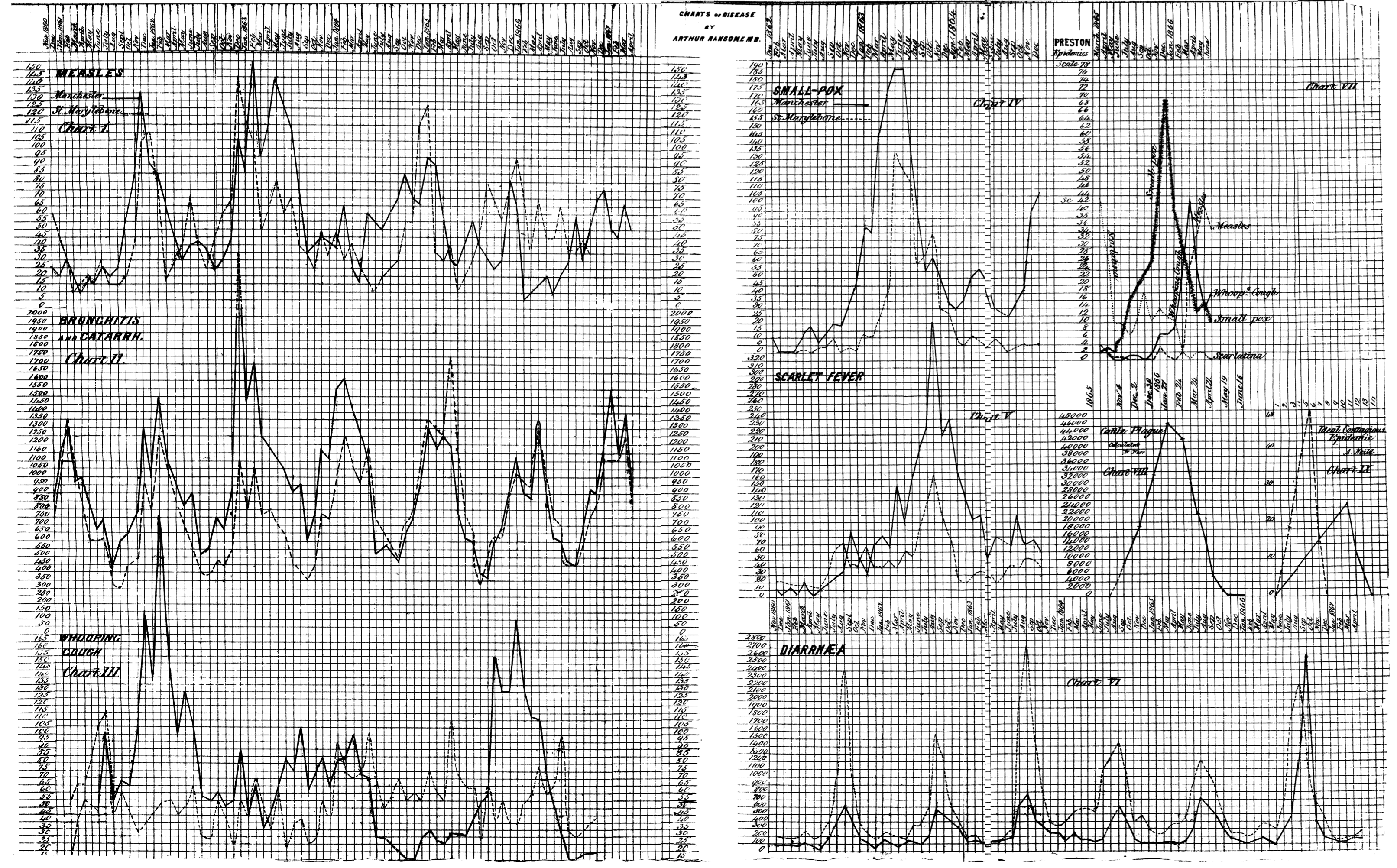
Waves of measles, bronchitis, whooping cough, smallpox, scarlet fever, cattle plague, and diarrhea. From Ransome, “On Epidemics: Studies by Means of Statistics of Disease,” British Medical Journal 2 (10 October 1868): 386-388.
After these early descriptions, the language of epidemic waves appeared regularly in the writings of others in the mid-nineteenth century. An 1871 editorial in the Medical Times and Gazette, for example, expressed frustration that smallpox, despite Jenner’s vaccination, preserved its “formidable character.” It was “one of those diseases which recur in more or less distinct cyclical periods—its prevalence being capable of being represented by a waved line.”
Talk of epidemic waves emerged for other diseases, too. John Tripe, sanitary officer in Hackney District in London, offered an account of scarlet fever in 1875: “the mortality from scarlet fever rises and falls every year, and also during a series of years, like a wave. The rise and fall in the mortality of each year, I shall call the ‘annual wave,’ and those which take place in a varying number of consecutive years I propose naming the ‘epidemic waves.’” Even though he struggled to determine the exact period of these waves, he believed that rigorous analysis and prediction was possible. Tripe moved here from offering the wave as a simile (“like a wave”) to discussing it as a form visible in recordkeeping, leaving open the question of from what real-world causal dynamics the form might arise. He also believed that analytic mastery of the waveform—calculating its wavelength and amplitude, say—would grant epidemiologists the power to predict the duration and severity of epidemics.
During this period the wave image was primarily metaphorical, a way of talking about patterns in data. Exactly what generated these “epidemic waves” remained a source of speculation.
As wave narratives spread, officials began to draw morals from their stories. In 1881 Thomas Prentis, the United States consul in Mauritius, described the epidemic history of that island. Malaria had been unknown there before 1857, rendering the island “one of the most salubrious places near the tropics,” but, Prentis explained, rapid economic development, deforestation, and industrial pollution, along with “a certain amount of carelessness on the part of the general inhabitants,” soon left the island “exceedingly unhealthy.” A “First Wave” of malaria struck in 1865. A second wave—the “great epidemic wave of 1867”—“spread over all that district which had been already visited by the wave of the previous year.” A third of the population of Port Louis died. A “third wave” struck in 1867. After the third wave subsided, malaria became an endemic presence in Mauritius. Here we find an early instance of a modern trope, an epidemic wave as punishment for environmental and social transgression.
Others looked elsewhere for explanations. Medical missionary Robert Felkin, writing in his 1889 On the Geographical Distribution of Some Tropical Diseases, kept the question of causality open, even at a moment when theories of germs and contagion were being developed in Europe by John Snow, Louis Pasteur, Robert Koch, and many others. Felkin mapped pandemic waves with reference to the Earth’s magnetic field and also to the world’s trade and westerly winds, suggesting that disease might travel with respect to geophysical channels, a formulation resonant with at-that-time still-not-yet-extinct miasmatic theories of disease transmission.
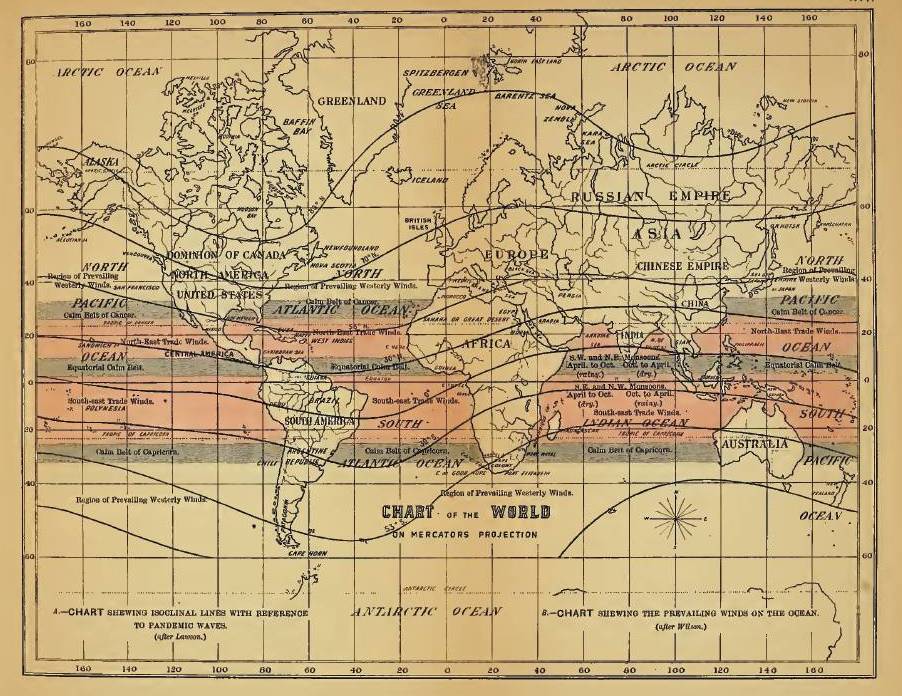
Felkin, “A Chart Shewing Isoclinal Lines with Reference to Pandemic Waves,” in On the Geographical Distribution of Some Tropical Diseases (1889).
What are we to make of these first episodes of epidemic wave talk? There is a tension in these early writings between descriptions of graphical patterns—of dynamics “capable of being represented by a waved line,” of things that might be wave-like “so to speak”—and claims that the regularities of disease propagation might have material causalities that would make epidemic waves actual, physical phenomena in the world, part of the ontological order of things. The shuttling back and forth between the graphical language of the curve and the more phenomenological concept of the wave—a force both formal and material—underscores that ambiguity. There is a parallel vagueness about whether epidemics are a property of a population or instead of a place. In ancient Hippocratic texts the word epidemic shifted from meaning “on the people” to something that circulates “in a country.” By the time a disease has become endemic, it resides within a population, but at the outset of an epidemic, there is a sense of something coming from outside and coming upon the population. This distinction is of course not always clear. Ransome, for his part, was interested in periodic waves, a phenomenon that elides any easy division between endemic and epidemic.
The use of a wave framework to describe phenomena beyond water, sound, and light became something of a popular and scientific fashion in nineteenth-century Europe.
As for exactly how this first wave of wave imagery caught on, a close reading of textual history would likely reveal trails of inspiration and borrowing, citation, and correspondence, but there is a bigger story at work as well. The use of a wave framework to describe phenomena beyond water, sound, and light also became something of a popular and scientific fashion in nineteenth-century Europe—with James Clerk Maxwell’s 1865 use of a wave model to unify electricity and magnetism only one famous and influential example. Scientists came to use “waves” to describe everything from seasonal trends in barometric pressure (Sir John Frederick William Herschel and William Radcliffe Birt’s 1846 “barometric waves,” which turned out only to exist on paper, not in the world) to the transformation of languages over time (Johannes Schmidt’s 1872 Wellentheorie, or wave theory of language change) to the propagation of social trends (sociologist Émile Durkheim’s 1897 account of the “undulating movements, distinct and successive,” of suicide). Practices of tabular and graphic representation were central to these descriptions and widespread. As historian of science Robert Brain suggests, the proliferation of graphing devices encouraged the notion that physical processes were not only representable through wave tracings, but were the result of oscillatory dynamics: in short, that waves were material and physical rather than merely mathematical.
These ideas laid the groundwork for what would become an enduring research program. Though the notion of a wave propagating through social bodies was supported in large measure by new kinds of tabulation and statistical techniques, questions arose about what lurked beyond the data. These early wave models of epidemics thus opened up new problems to be investigated: what caused the waves (if they were indeed more than a mere artifact of statistical aggregation), and whether they might be used to forecast courses of infection.
• • •
From Description to Prediction: Mathematical Wave Modeling in Epidemiology
This first generation of epidemic wave analysts mostly relied on a technique of plotting data points and noting the characteristic shape of rise and fall. But a second generation in the early twentieth century sought to use mathematics not just to record but also to model the spread of epidemics. Their work was influenced by new techniques in statistics, notably the work of the British statistician Karl Pearson (especially under his editorship of the journal Biometrika).
Glasgow physician-statistician John Brownlee, for example, applied Pearson’s techniques to epidemics. Like Farr, whose work he analyzed in detail, he believed that epidemics were governed by natural laws. In 1909 he drew an explicit comparison to the crowning achievement of Newtonian science: “the main laws which regulate epidemics are as simple as the law of gravitation, though the application of them to the diverse conditions which govern epidemics is often of considerable complexity.”
As struggles against epidemics continued into the twentieth century, scientists developed mathematical models meant not just to describe but also to predict disease propagation.
Brownlee developed techniques to predict the course of an “epidemic wave” and compare this to real-world data. The tight fit displayed in his graphs suggested the power of his models, though he did not explain how he performed his predictions. He also relied significantly on aesthetics and intuition. He was struck, for example, by “the near symmetry of the form of the epidemic curve.” He also drew inferences about the underlying dynamics that should give rise to that pattern, concluding that the answer must lie in a change in behavior of the pathogen, not the loss of susceptible people in the population. The course of an epidemic wave, he had concluded in 1906, followed the internal logic of the infecting agent:
An epidemic is an organic phenomenon, the course of which seems to depend on the acquisition by an organism of a high grade of infectivity at the point where the epidemic starts, this infectivity being lost from that period till the end of the epidemic at a rate approaching to the terms of a geometrical progression.
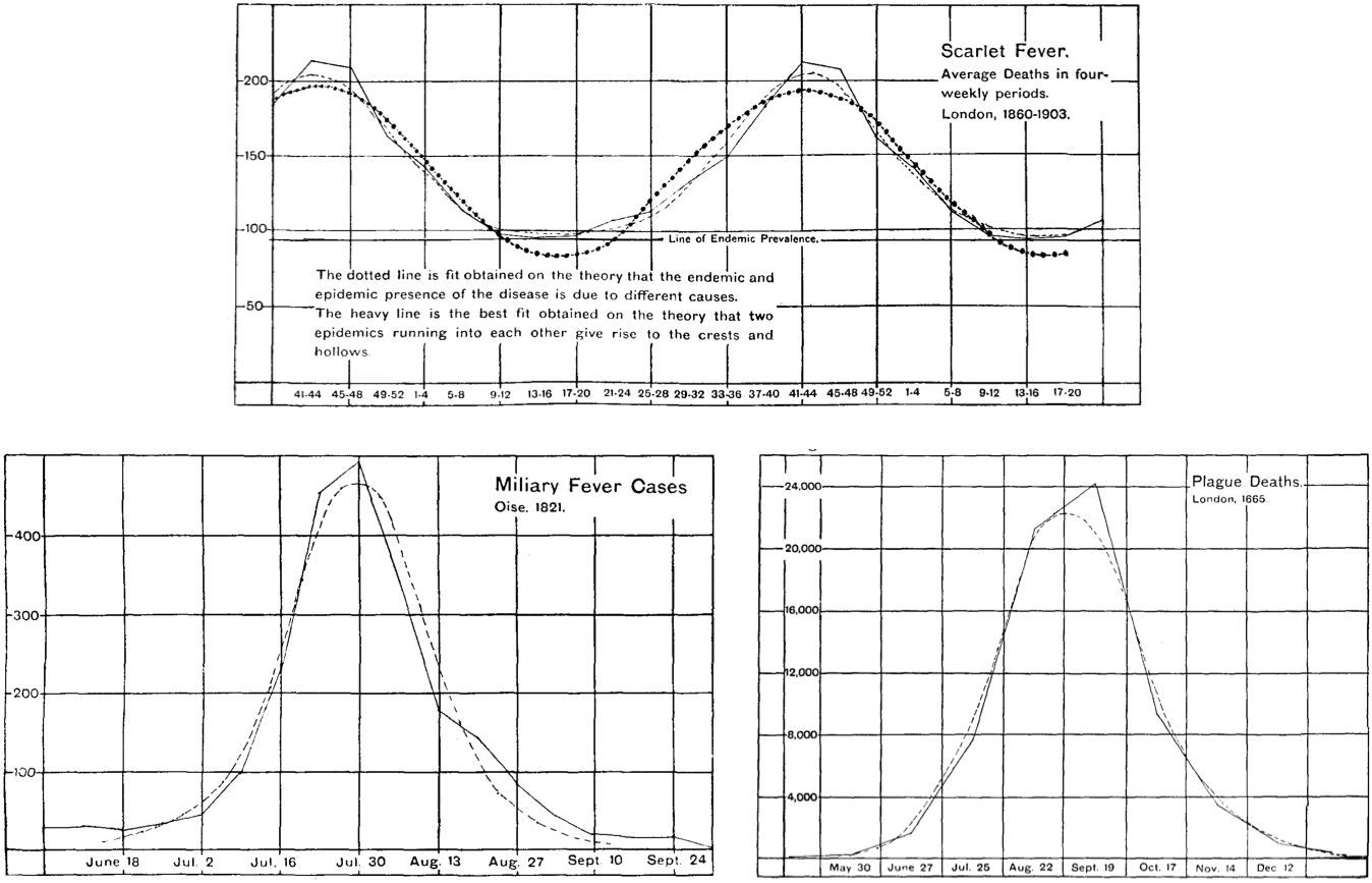
Waves of scarlet fever, military fever, and plague. From Brownlee, “Statistical Studies in Immunity,” Proceedings of the Royal Society of Edinburgh (1905-1906): 484-521.
This question captured the attention of one of England’s experts in tropical medicine and infectious disease. Ronald Ross, who served for twenty-five years in the Indian Medical Service, won the Nobel Prize in 1902 for deciphering the life cycle of the malaria parasite. He was also a gifted mathematician. In a short essay in the British Medical Journal in 1915, he proposed “what may be called pathometry—that is, the mathematical study of epidemiology.” He derived a set of differential equations that could be used to understand how infections would run their course in living populations. His models considered the numbers of births and deaths (at baseline in a population), the infection rate, and the recovery rate of the infection. In his analysis, “The Curve of New Cases” had a characteristic shape, anticipating the plots so ubiquitous today: “It begins at a small value . . . and then rises more or less rapidly, reaching its maximum . . . and then falling again and approximating to a limit.” This resembled the Farr and Brownlee bell-shape curves, but without their symmetry—there was a long tail in the decline phase.
Ross reported his work in 1916 and was amazed that no one yet had produced an adequate mathematical model of epidemics: “vast masses of statistics have long been awaiting proper examination.” The patterns demanded attention. Why did some diseases (leprosy, tuberculosis) have a more or less constant presence, while others (measles, malaria, dysentery) exhibited regular periodicity, while still others (especially cholera, plague) struck suddenly and then disappeared for many years? He considered familiar hypotheses:
Are the epidemics in the second class of diseases due (1) to a sudden and simultaneous increase of infectivity in the causative agents living in affected persons; or (2) to changes of environment which favour their dissemination from person to person; or (3) merely to the increase of susceptible material in a locality due to the gradual loss of acquired immunity in the population there; or to similar or other causes?
Answering these questions could help to clarify etiology. He likened the task at hand to important developments in the history of science: “Behind these phenomena there must be causes which are of profound importance to mankind and which probably can be ascertained only by those principles of careful computation which have yielded such brilliant results in astronomy, physics, and mechanics.”
Ross described, in particular, two approaches to thinking about the role of causality in epidemiological modeling. The first involved a posteriori analysis: starting from observed data and working backward to deduce the underlying cause, just as Farr and Brownlee had hoped to do. Ross, by contrast, favored a second approach, an a priori method: modeling the underlying causes using differential equations, using them to make predictions, and checking the results against observed data. As best as he could tell, this second approach was “first commenced” by himself, with his malaria studies in 1899.
Ross extended this work with Hilda Hudson, a Cambridge-trained mathematician. They focused on developing a system of equations and deciphering the constants that would be needed to apply this system to specific diseases—the basic parameters of disease that resemble the parameters still input into models today. Ross and Hudson demonstrated that a range of factors needed to be considered to model epidemics accurately. Some depended on the pathogen, such as rate of infection, case mortality, and case duration (were these constant over an epidemic, they asked?). Others were features of the hosts or environment, including age, sex, social position, climate, temperature, and availability of vectors. While their model divided the population into two classes, later named compartments—the unaffected and the affected (assumed to be both infectious and immune)—they also knew this to be a simplification: “to represent the facts accurately, a much larger number of classes would have to be considered.” While the language of waves was not present in their work, their graphs included varied patterns—isolated, periodic, or turbulent—all of which are reminiscent of earlier wave imagery.
Epidemic curves from Ross and Hudson, “An Application of the Theory of Probabilities to the Study of a priori Pathometry,” Proceedings of the Royal Society of London. Series A, Containing Papers of a Mathematical and Physical Character 93 (3 May 1917): 225-240.
Ross and Hudson published their work in 1917, and the next year, as we all know now, disaster struck. Pandemic influenza spread throughout the world, possibly from an origin in the United States, striking cities and countries worldwide, many of them already ravaged by World War I. Measures of total mortality vary widely but are horrific by any estimate, with 40 to 100 million deaths over three pandemic waves in 1918 and 1919. Health departments produced charts showing the classic form of rise and fall over time and place, making the epidemic wave familiar to readers throughout the world. The popular press used the language of waves, too. U.S. newspapers from the period offer such headlines as “City Closed to End Wave of Influenza” (Minneapolis Morning Tribune, October 12, 1918), “Influenza Tidal Wave Is Turned” (The Birmingham News, October 27, 1918), “14 Die, 36 Stricken in New Flu Wave” (The St. Paul Daily News, November 20, 1918), “Concerned Over Influenza Wave” (Boston Globe, December 24, 1918).
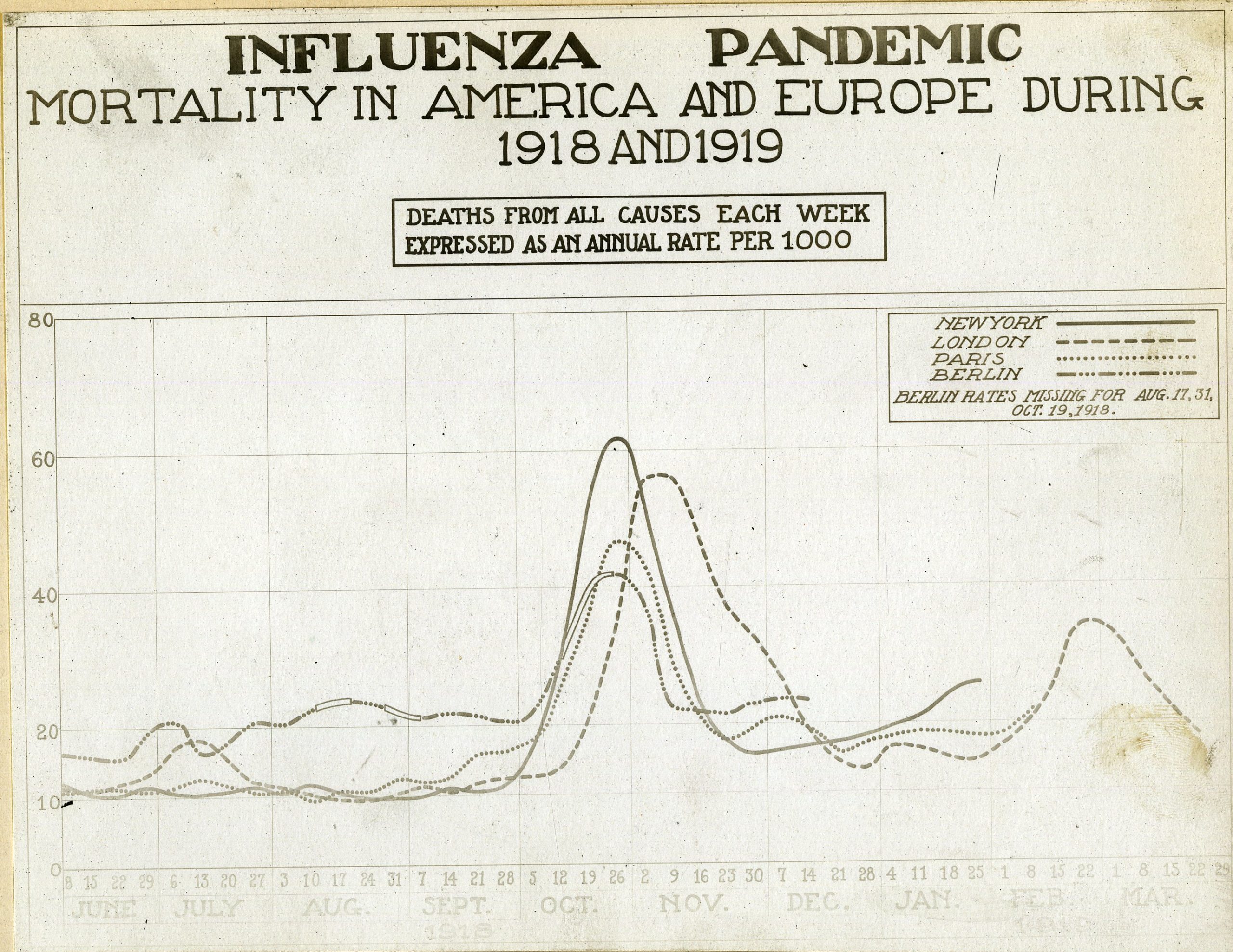
“Influenza Pandemic Chart” (Reeve 003143), 20 August 1919. From the Otis Historical Archives, National Museum of Health and Medicine.
The trauma of influenza made Ross’s differential equations starkly relevant. Why did influenza appear, kill possibly forty million people, and then disappear? This question prompted substantial consideration by epidemiologists in the 1920s. As historians J. Andrew Mendelsohn and Warwick Anderson have each shown, prominent epidemiologists turned their attention away from the sort of reductionist bacteriology that had captivated them since the 1880s and toward a mode of thinking that emphasized the ecological complexity of biological systems, including epidemics.
Two Scottish mathematicians who would become central figures in the field—Ogilvy Kermack and Anderson Gray McKendrick—took up this question in the late 1920s and concluded that an epidemic did not end because it ran out of susceptible people but rather because it reached a threshold of herd immunity. McKendrick had worked for years in the Indian Medical Service, assisting Ross with his work on mathematical epidemiology, and then serving at the Pasteur Institute at Kasauli (in the Punjab) from 1914 to 1920. Forced to return to Scotland because of illness, he became director of the laboratory of the Royal College of Physicians of Edinburgh. Kermack, a biochemist, joined that lab in 1921. Blinded by a chemical explosion in 1924, he began to collaborate with McKendrick modeling epidemics. The two published three key articles, in 1927, 1932, and 1933, that formed the basis of a new research program, one that remains at the core of epidemic models today.
A new generation of mathematical epidemiologists sought to characterize the origins of epidemic waves, treating them not just as patterns of data but as the result of some more fundamental underlying mechanism.
Like their predecessors, Kermack and McKendrick sought to understand what brought an epidemic to an end. “One of the most important problems in epidemiology,” they wrote, “is to ascertain whether this termination occurs only when no susceptible individuals are left, or whether the interplay of the various factors of infectivity, recovery and mortality, may result in termination, whilst many susceptible individuals are still present in the unaffected population.” They realized that to persist, epidemics needed not just a few susceptible individuals, but a certain density of them in a population; past this threshold the epidemic would begin to decline.
With this basic theory in mind, they crafted a set of differential equations that might capture the trajectory of an epidemic. Continuing in the same vein as Ross, they produced a “compartmental” model that identified individuals as either susceptible to infection (S), infected (I), or recovered from infection (R), with parameters to determine removal from the model (by recovery or death) and transmission rates. Armed with these equations and estimates of the parameters, they tested them on data from an outbreak of plague that struck the island of Bombay from December 1905 until July 1906, a classic rise and fall over thirty weeks. This was a complicated case, involving the movement of the pathogen among rats, fleas, and humans, something that required assumptions about susceptibility and transmission. They worried that these assumptions would compromise their analyses, yet they achieved good results, with the “calculated curve” approximating the observed data. While Kermack and McKendrick did not invoke the image of the wave, their equations allowed them to provide a mathematical structure for the epidemic waves that previous scholars had fastened upon. Their curves, in turn, would be read as waves by future scholars and pundits.
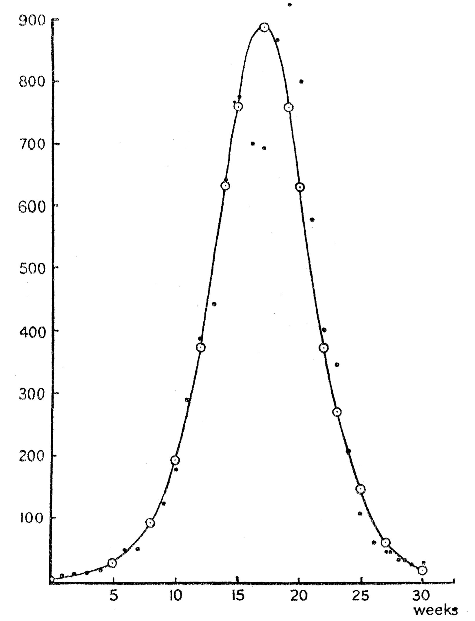
Modeling Plague in Bombay, 1905–1906. From Kermack and McKendrick, “A Contribution to the Mathematical Theory of Epidemics,” Proceedings of the Royal Society of London. Series A, Containing Papers of a Mathematical and Physical Character 115 (1 August 1927): 700-721.
While Kermack and McKendrick were modest in their assessment of their work, it launched what is still a vibrant field within mathematical epidemiology: compartment models, from basic SIR models to an endless series of refinements and elaborations, are still used today. The figure of the wave remains central in many of them (for instance, here, here, and here).
In all of the models we have discussed, the mathematical idiom often underwrote a sense of an inevitable, inexorable, rise and fall, driven by nothing other than the intrinsic dynamics of pathogen and host—just as Newton’s laws of gravitation and motion fully determine the course of planetary bodies given fixed initial parameters. In the work of Kermack and McKendrick there was no appeal to measures that might be taken to change infection curves; their focus was on mathematical understanding, not on the practice of public health. Such reductionism can be deceptive. As Farr and other epidemiologists have known since the nineteenth century, epidemics are highly sensitive to particular social and environmental contexts, and social interventions can shape the course of an epidemic. Too narrow a focus on a model can obscure this insight. The recent social life of such models has seen them mutate, entering nowadays as components in the social management of epidemics themselves—becoming, in the process, additional variables that shape the course of infectious disease.
• • •
From Prediction to Prescription: Flattening the Curve
Discussions of “flattening the curve” of an epidemic began to appear in the aftermath of influenza in the 1920s. The unprecedented scale of the response to COVID-19, however, has brought an intensified attention to the rhetoric of epidemic waves.
In February this year, some epidemiologists projected that if left to its own devices, SARS-CoV-2 might infect 40 to 70 percent of the world’s population by year’s end. At that point, they asserted, herd immunity of the sort described by Kermack and McKendrick would start to slow the pandemic. But no one wanted to allow such an extensive epidemic and the mortality that would ensue. In order to mitigate the effects of uncontrolled viral transmission, public health officials, hospital administrators, government leaders, with broad public support, embraced strategies to reduce the spread of infections, pressing for frequent hand-washing, self-isolation, quarantine, and social distancing. Decreasing close contacts between people could slow virus transmission. Decelerated propagation would “flatten” the upward slope and the peak of the curve representing the growth of case numbers over time.
The mixed imagery of wave and curve points to a kind of double social meaning for epidemic graphics today—combining math and morality, rational forecasting and affective persuasion.
How did talk of “flattening the curve” come to prominence? In 2006 the United States was grappling with fears of resurgent influenza. This was a fraught time, with the attacks on 9/11 and the wars in Afghanistan in Iraq compounded by new fears of epidemic disease, from the 2001 mailings of anthrax to news outlets and politicians to the SARS epidemic in 2003–2004. Preparedness, whether for terrorist attacks or pathogens, became the new cause célèbre. The federal government unveiled a plan for confronting the emergence of a possible new pandemic flu. That plan assumed that failures of medical infrastructure would be inevitable, with hospital bed demand likely outrunning supply, requiring the transfer of care to improvised facilities as well as the rationing of health care. Two analyses, one led by a historian and one by a mathematical modeler of epidemics, each showed that specific public health policies, especially social distancing, had altered the course of influenza in 1918 in cities that implemented them early and aggressively. These studies offered graphs of epidemic intervention scenarios to reinforce their point, and government officials invoked these visuals in turn. As the Centers for Disease Control and Prevention argued in 2007—aided by a graphical representation—these non-pharmaceutical mitigation strategies “initiated early and maintained consistently during an epidemic wave” may “delay the exponential increase in incident cases and shift the epidemic curve to the right in order to ‘buy time’ . . . [and] decrease the epidemic peak.”
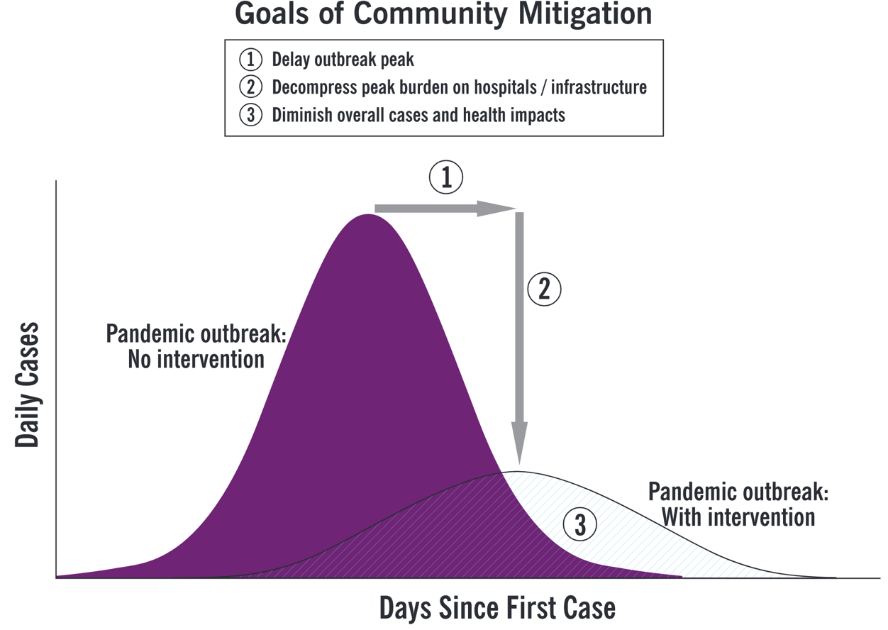
Flattening the curve. From the Centers for Disease Control and Prevention, “Interim Pre-pandemic Planning Guidance: Community Strategy for Pandemic Influenza Mitigation in the United States: Early, Targeted, Layered Use of Nonpharmaceutical Interventions” (2007).
This mixed imagery of wave and curve points to a kind of double social meaning for epidemic graphics today. On the one side, the “wave” acts as a bracing and frightening portent, conveying the urgency of preparing for a coming deluge. The “curve,” meanwhile, offers a more technical mode of graphical representation, one that may be employed not only to assess and to predict, but also programmatically to intervene in the course of disease transmission. The portrayal of the modified wave promises a kind of anticipatory solace, an indication of what a collective can achieve if it acts wisely. Diagrams of COVID-19 infection waves/curves therefore mix together the mathematical and the moral, rational forecasting and affective persuasion. These representations, in other words, serve more than a strictly scientific function, inspiring dread or sober resolve, as well as structuring predictions that may be issued to guide public health practice and the allocation of medical resources.
Representations of epidemic waves thus pose the propagation of disease as a process at once organic and social, natural and cultural. In so doing, they have become tools for enacting what the sociologists Ulrich Beck, Anthony Giddens, and Scott Lash have called “reflexive modernization”: a form of social planning that takes for granted the ability to intervene, recursively, in the nature of society. If, as Charles Rosenberg once put it, epidemics unfold as narratives that “follow a plot line of increasing and revelatory tension,” the reflexive approach of curve-flattening seeks to read ahead, changing the “plot line” (or the plotted line) in real time. The general public is now invited to contribute to that rewriting itself as talk of “flattening the curve” circulates through popular culture. As Catherine Montgomery and Lukas Engelmann recently wrote, the idea itself “has gone viral, with DJs, actors and other celebrities exhorting others to do their bit to achieve epidemiological victory.”
These social meanings have consequences. The idea that curves can be changed offers a kind of socio-technocratic optimism, but it can also lead to epidemic scapegoating.
These social meanings have consequences. The idea that curves can be changed offers a kind of socio-technocratic optimism, but it can also lead to epidemic scapegoating. Public as well as professional commentators on disease have long found ways to rationalize epidemics—to explain them away as the result of divine providence, racial and racist essentialism, and unsanitary cultural practices. In its traditional form this has almost always involved trying to assign blame for an epidemic’s origin and spread, censure that all too often falls on ethnic minorities, immigrants, and colonized peoples. This happened once again with the novel coronavirus. Following in that tradition, the ubiquity of the COVID-19 infection curve, with its call to reflexive action, has helped to produce a new genre of shaming and blame-casting, motivating anger toward people imagined to be inadequately devoted to flattening the curve. Many who have been willing and able to “socially distance” blame those who have not, from revelers in bars or on beaches to gatherings of protesters and activists from across the political spectrum.
In this light, it is important to recognize that the graphical outputs of infection models capture only some relevant features of an epidemic. While they have taken pride of place in many of the stories told about COVID-19, they do not tell the whole story. Without proper contextualization, the language of waves and curves can itself flatten the complexity of the pandemic.
Many commentators noted this early on: focusing solely on infection cases versus time obscured other important features of the spread and significance of COVID-19, including its geographical variability and the unique risks the disease poses to the highly mobile, the vulnerable, and the marginalized. There had of course been recognition since the early days of the epidemic that curves were geographically localized and distinct: Wuhan experienced the epidemic wave first, then Iran and Italy, and now most parts of the world. Still, some thought the various curves would all take the same basic shape. In fact, one of the most widely cited models, from the University of Washington’s Institute of Health Metrics and Evaluation, initially used the Wuhan wave to predict the wave in all other cities. It has since become clear that the COVID-19 “waves” have taken very different shapes in different cities and countries. US News and World Report early on called attention to such local variation, pointing out that COVID-19 is “going to move through communities in waves—each community is going to be hit at a slightly different time, so their surge, their peak will be different.”
It has indeed become clear that the wave moves differently within places, affecting some populations more than others, following familiar differentials of race, class, and power. In the United States, African American, Hispanic, and Indigenous populations have suffered disproportionate burdens of disease and death, an epidemiological consequence of structural racism, with essential workers—often people of color—“being sacrificed to fuel the engine of a faltering economy,” as Adam Serwer wrote last month. Many plots of epidemic trajectories scarcely resemble waves at all, and instead feature spikes, plateaus, and even a few cases of unrelenting rise. Properly qualified and complicated, the “wave” model may reveal such disparities, but it cannot explain them. The infectious disease physician and global health scholar Eugene Richardson, for instance, has argued that “mathematical models of infectious disease transmission serve not as forecasts, but rather as a means for setting epistemic confines to the understanding of why some groups live sicker lives than others.”
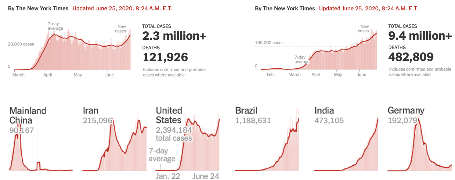
“Coronavirus in the U.S.: Latest Map and Case Count” and “Coronavirus Map: Tracking the Global Outbreak,” from the New York Times.
It can thus be useful to recall that the wave model is not the only epidemic visualization out there. Farr (and Ransome as well) had likened an epidemic to a conflagration. Such dire imagery—dating back at least to Boccaccio’s description of the Black Death in his fourteenth-century Decameron as “a fire racing through dry or oily substances”—has begun to reemerge with COVID-19. Geographical maps of infection “hot spots” often use a palette of saturated color—with red often standing for high case incidence—to track disease spread, and, in their invocation of “heat,” exhibit visual similarity with maps that record forest or brush fire intensities.
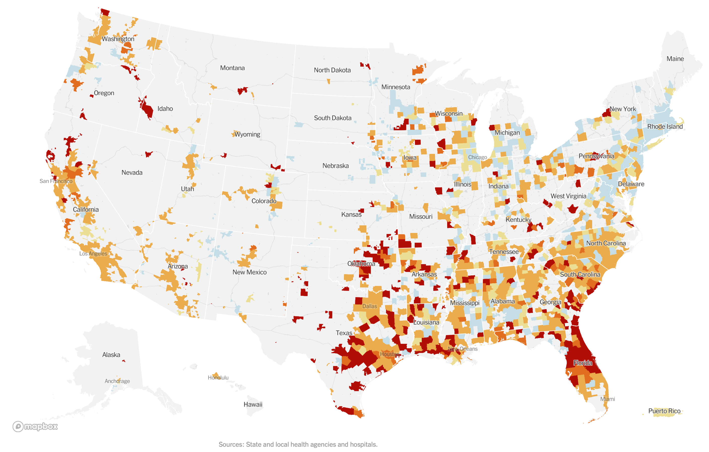
“Coronavirus in the U.S.: Latest Map and Case Count,” from the New York Times (June 25, 2020).
The epidemiologist Marc Lipsitch has invoked similar fire imagery in his recent work, suggesting that different metaphors (fires, waves, shipwrecks) capture different aspects of the complex phenomena that make up an epidemic. While we think of a wave as smoothly propagating through its medium, dissipating as it expands over time and space, a forest fire can flare up any time its sparks land on dry wood. Where waves imply a possible return to equilibrium, fires imply volatility. And note that waves, once generated, do not grow exponentially, as forest fires—and epidemics—do. Lipsitch’s collaborator, Michael Osterholm, has also invoked fires, telling Meet the Press on June 21, “I don’t think we’re going to see one, two and three waves—I think we’re just going to see one very, very difficult forest fire of cases.” The pandemic seemed newly unstoppable, akin to those wildfires that had torn across Australia, the Amazon, and California in the late 2010s. “I think that wherever there’s wood to burn, this fire is going to burn it,” Osterholm concluded.
As one final example of alternative representations, consider a graphic that presents data from various countries by plotting COVID-19 deaths per day along with the rate of change of that number:
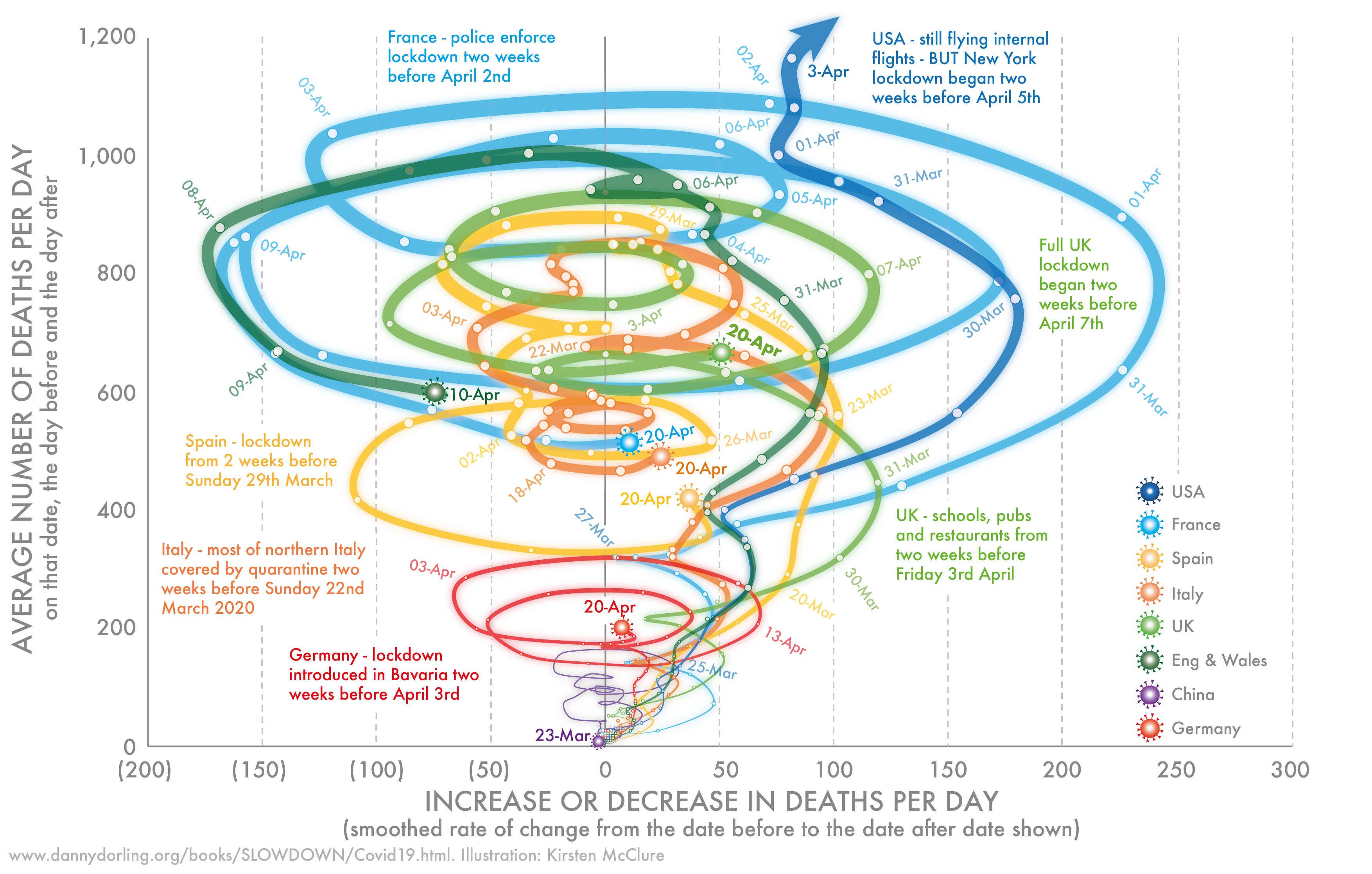
Mortality in seven countries attributed to COVID-19, January 23 to April 20, 2020. From Dorling and McClure, “Three Charts that Show Where the Coronavirus Death Rate Is Heading,” The Conversation, 27 April 2020. With permission from the author and artist.
This image is not necessarily better than the more familiar infection curve tracking cases over time—after all, it is quite difficult to interpret at a glance—but it does reveal how different modes of representing epidemiological data and infection forecasts may tell different stories: in this case, suggesting a dynamic different than the inexorable arrival of the future. If one traces a country’s line over time, the number of new deaths and cases can increase, decrease, and increase again, in a swirl of epidemic entanglements, conveying the threat of an epidemic (any movement up or to the right) as well as the possibility of control. The chart also sketches out a graphical representation of the temporal disorientation that has shaped so many people’s divergent individual and community experiences of the pandemic’s unfolding.
While they have taken pride of place in many accounts of COVID-19, waves do not tell the whole story. Without proper contextualization, this language can itself flatten the complexity of the pandemic.
Of course, talk of metaphors and representations should not divert our gaze from the material, embodied horrors of COVID-19—from the countless people who have died, to the many more who surely will. Yet the future of the pandemic remains uncertain, and representations play a crucial role in conveying problems and shaping solutions. Some people, in areas where the disease has arrived and passed, wonder whether it will return. Others endure its fury now. Still others await its full arrival with trepidation. Regardless of how Pence and Fauci parse the phases of the pandemic, though, the language of epidemic waves is here to stay, carrying a significance both symbolic and epistemic, existential as well as epidemiological. As we grapple with the complexity of wave language and imagery, we can learn from the scientific and political history of epidemiology to think critically and creatively about whose and which stories are told, and which are submerged.